GUIPlot Screen Images
A
Graphical Display of GUIPLot's Fine Points
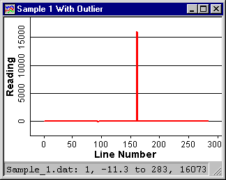
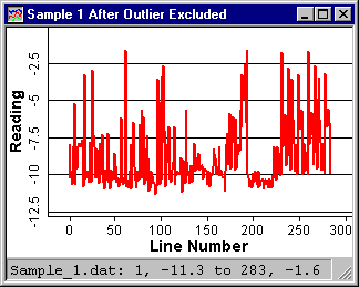
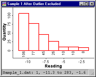
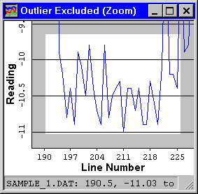
The three plots below are of the same data file. The difference between the first and second is that the first has an outlier; a single reading that isn't valid. This is real-world data. It's not always nice and clean. With most data analysis programs, to get rid of the outlier and get to the data you want to see, you would have to edit the data file or add several more lines of code to the script you had already written. With GUIPlot you simply hold down the Ctrl key, draw a box around the outlier, and out pops the hidden data. The second plot, with the outlier excluded, shows the data that was obscured in the first plot. By pressing the "D" key, a duplicate plot window is displayed. Then, pressing the "H" key will switch to histogram mode, as shown in the third plot.
Once you've excluded data, you can save your plot as an object that stores all of the plot setup parameters as well as which lines of data from the file were excluded. This allows examining the same data file later, even if new data has been added to the file. Opening the object will display the new data with the old outlier still excluded. This feature makes GUIPlot a natural for monitoring production processes. And with the auto-update feature, you can monitor data or log files as they grow.
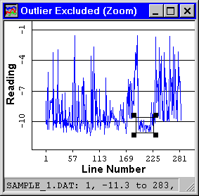
Here is the same data again, this time with a zoom region defined. The second plot is the zoom window, showing a detailed view of the zoom section. The black boxes on the corners of the zoom region can be dragged around or the entire box can be dragged to change the location and/or size of the zoom region.
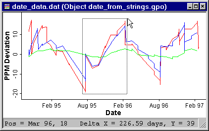 |
The plot on the left shows how you can measure a time
span. The status bar indicates the X-Y coordinate of the
current cursor position (Mar 96 in the X axis, 18 in the Y) as well as the X and
Y deltas covered by the selection box. Units of delta
automatically change from seconds to minutes to hours,
days, and years as the range increases. The dates displayed on the X axis can be formatted by defining which elements (day, hour, month, etc) you want to use, interspersed with words or punctuation of your own design. |
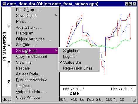 |
This image illustrates the plot window's context menu, activated with the secondary mouse button. All of the plot window's operations are accessed through this menu. Most of the operations can alternatively be activated with a single key stroke, indicated by the underlined letter on the menu item. |
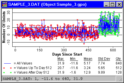 |
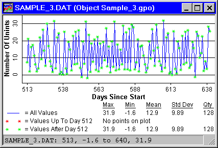
The next plot demonstrates several GUIPlot
features; "C2" (blue lines), "C2 ? L <= 512" (red points), and "C2 ? L > 512" (green points) The part in quotes (") is the actual formula. The X axis is defined as simply "L", which is the line number from the data file (there was one reading taken per day). The first Y formula draws blue lines connecting all points in column 2 of the data file. The second formula plots only red points (no lines), also from column 2, but only up to day 512. This condition is defined by the "? L <= 512" part of the formula. The question mark (?) separates the boolean condition from the actual formula. A point is plotted where the condition is TRUE. The third formula plots column 2 from day 512 as green points. |
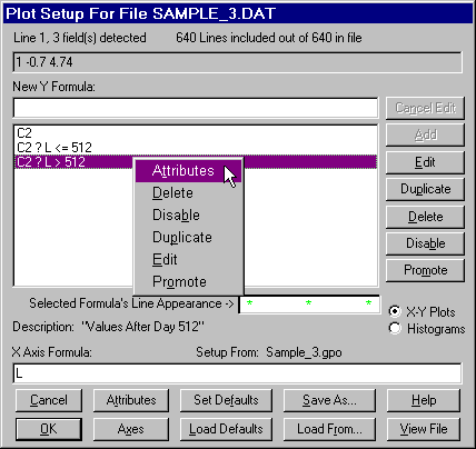 |
This image shows the plot setup window, the heart of GUIPlot. The large list box in the center of this window contains the Y axis formulas. This setup produced the plot above. Each formula creates a set of X-Y coordinates to be plotted. When a formula is selected here, it can be edited, deleted, etc. This picture was captured with the context menu activated which provides the same, but quicker, functions as the buttons on the right. Selecting Attributes brings up a window that allows changing colors, line types, etc, for the selected formula. The X Axis Formula generates the X coordinates for all of the Y formulas. Each Y formula can have it's own, independent X formula, if desired. The Axes button brings up a window that allows changing scaling parameters, axis labels, etc. Once the setup has been fine tuned, it can be saved for future use on similar data files. |
 |
A boolean condition on the X axis formula is applied to the entire plot. For example, if the same condition "? L > 512" were applied to the X axis formula, the plot looks like this next plot to the left. This is a subset of the data shown in the plot above, but is only the data where the X values are greater than 512. |
Note that these plots are small to save space on this Web page. GUIPlot windows are all independent and can be any size and there can be any number of them open. GUIPlot is designed to make the most of the precious space on your desktop. That's why the only menu on a plot window is the popup menu, activated with the secondary mouse button. And that's why you're given the option of turning off the legend, statistics and status bar on each window to get more room for data.
 The window to the
left is a picture of the main window which was kept as small as
practical. It, too, can be made as large or as small as you like.
Even when minimized, you can still drop files on it. Keep a
shortcut to it on your desktop and just drop files on the icon
when you want a plot. The setup program lets you choose to put shortcuts
on the desktop, Start menu and/or Send To menu.
The window to the
left is a picture of the main window which was kept as small as
practical. It, too, can be made as large or as small as you like.
Even when minimized, you can still drop files on it. Keep a
shortcut to it on your desktop and just drop files on the icon
when you want a plot. The setup program lets you choose to put shortcuts
on the desktop, Start menu and/or Send To menu.
These are just a few of GUIPlot's features. Read about more here. Then I hope you'll download the Demo and check out the rest.
Return to
GUIPlot
home page
